The Art of Glassmorphism: Redefining the Elite Corporate UI in 2026
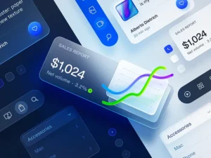
Visualizing the transparency and depth of high-performance Glassmorphism architecture.
In 2026, digital design is moving beyond flat surfaces toward depth and multi-layered realism. Among the most effective trends for premium brands is Glassmorphism—a style that mimics frosted glass to create a sense of hierarchy and sophistication that standard layouts cannot achieve.
What is Glassmorphism?
At its core, Glassmorphism relies on a combination of transparency, background blur, and subtle borders. When implemented via custom code rather than heavy plugins, it allows UI elements to feel weightless, floating above the background without compromising page load speeds.
Layer Anatomy: How light and blur interact to create visual depth.
The 4 Pillars of the Glass Effect
To achieve an elite look that maintains high readability, your custom-coded components must balance these four elements:
| Component | Purpose |
|---|---|
| Backdrop Blur | Creates focus by softly blurring background content. |
| Transparency | Allows background colors to bleed through for a modern feel. |
| Subtle Borders | Defines edges using semi-transparent white strokes. |
| Layered Depth | Establishes a clear visual hierarchy for the user. |
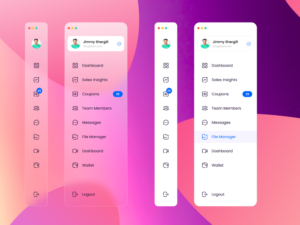
Why it Works for Premium Brands
Brands aiming for an innovative and premium identity use Glassmorphism to highlight key digital products. When executed with clean CSS, it maintains a sophisticated "Elite Corporate" vibe while ensuring that the text remains crisp and highly legible against dark themes.
Conclusion
Mastering Glassmorphism requires a delicate balance between visual flair and technical performance. By avoiding "code bloat" and focusing on custom-coded implementations, you can create a bridge between minimalism and high-end visual storytelling.
Elevate Your Brand's UI
Ready to build a high-performance, custom-coded website with elite aesthetics?
Consult with Tayyab